


Hydro Plus Branding & Packaging
Hydro Plus Branding & Packaging
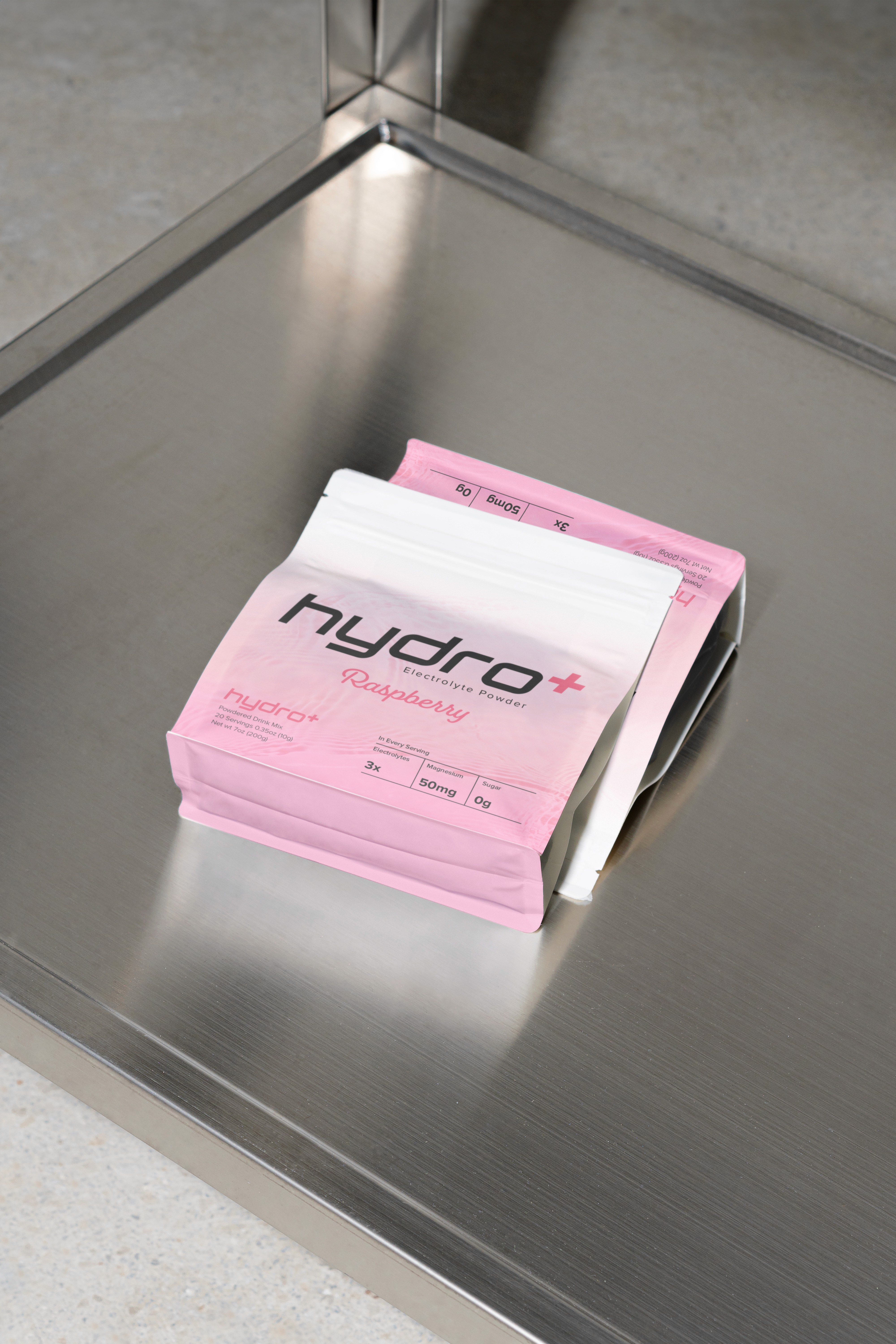
Hydro Plus enters the hydration space with quiet confidence, a visual identity built on precision, clarity and modern function. The goal was to create a brand that feels as light and refined as the product itself.
From strategy through to packaging design, every decision was guided by simplicity and balance. The custom wordmark, minimal typography and disciplined layout system reflect a performance driven brand with lifestyle appeal.


DESIGN SYSTEM
DESIGN SYSTEM
We developed a flexible visual identity that adapts effortlessly across Hydro Plus’s two core products hydration drinks and powdered mixers ensuring consistency in every format, from shelf to screen. A restrained palette and minimal design language keep the focus on purity, performance and clarity. The result is a cohesive modern brand that blends lifestyle appeal with functional design, built to feel clean, confident and refreshingly simple.
We developed a flexible visual identity that adapts effortlessly across Hydro Plus’s two core products hydration drinks and powdered mixers ensuring consistency in every format, from shelf to screen. A restrained palette and minimal design language keep the focus on purity, performance and clarity. The result is a cohesive modern brand that blends lifestyle appeal with functional design, built to feel clean, confident and refreshingly simple.


