ATMOS
ATMOS
SURF & WEATHER APP


ATMOS BRANDING AND APP DESIGN
ATMOS BRANDING AND APP DESIGN
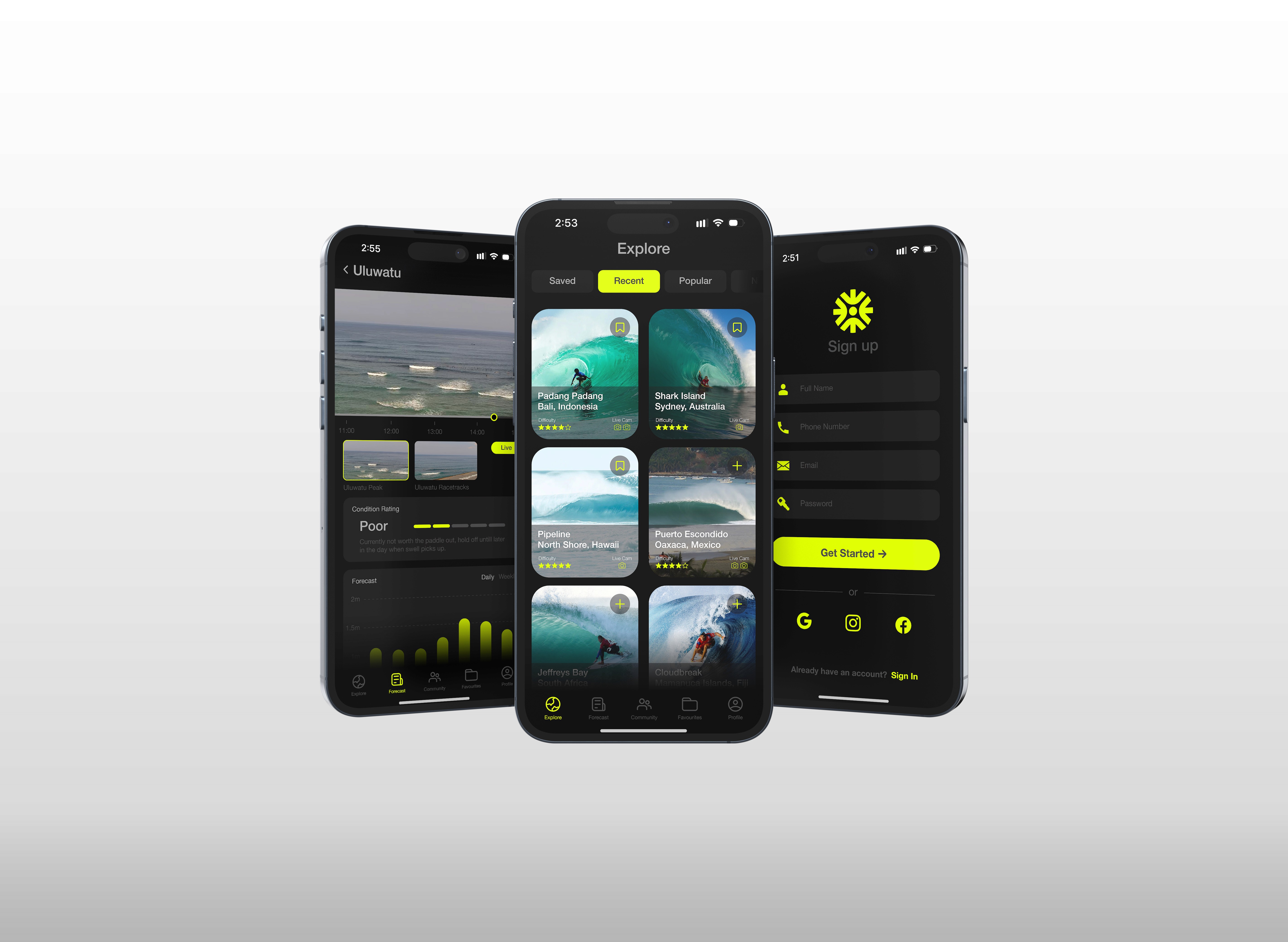
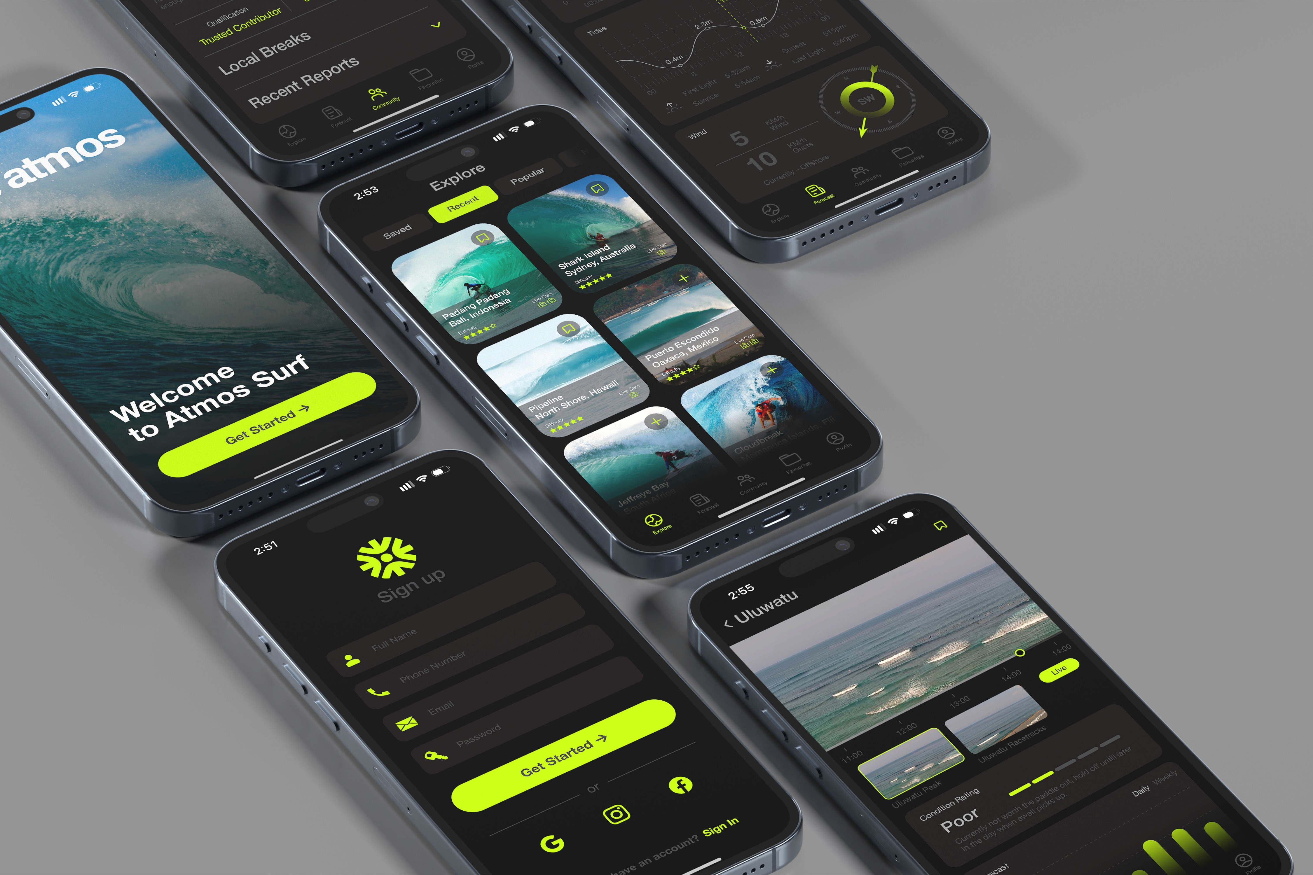
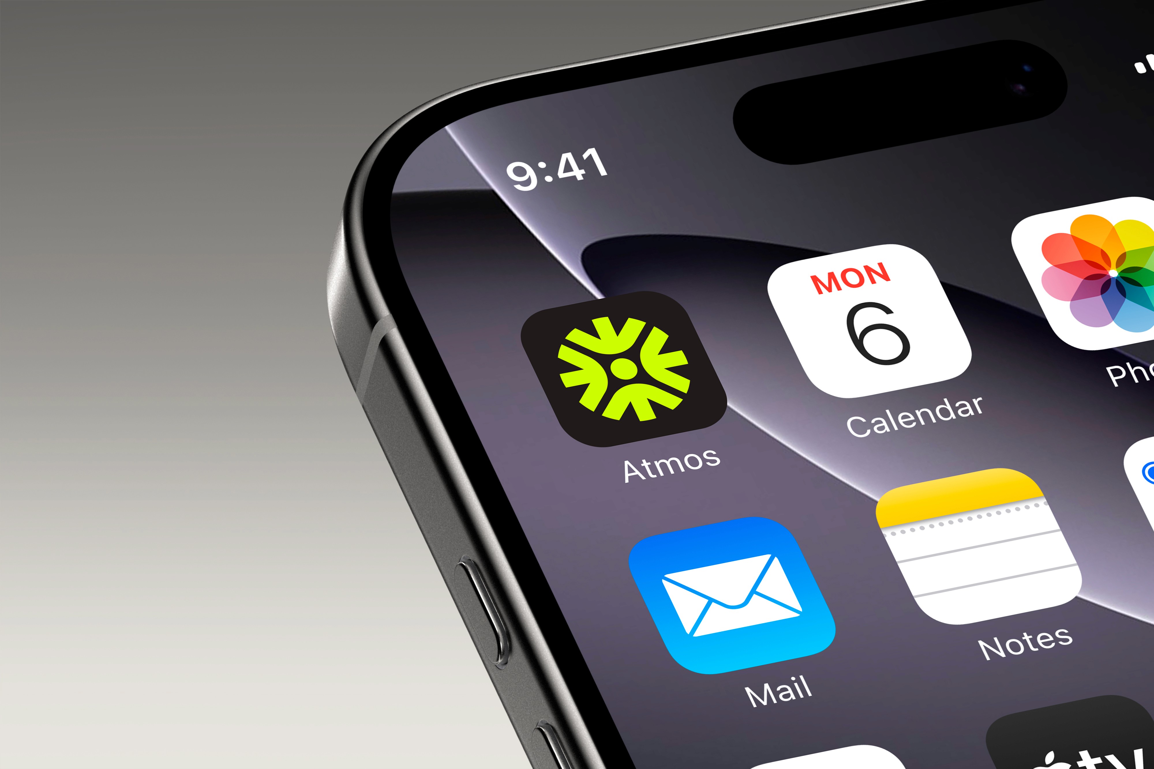
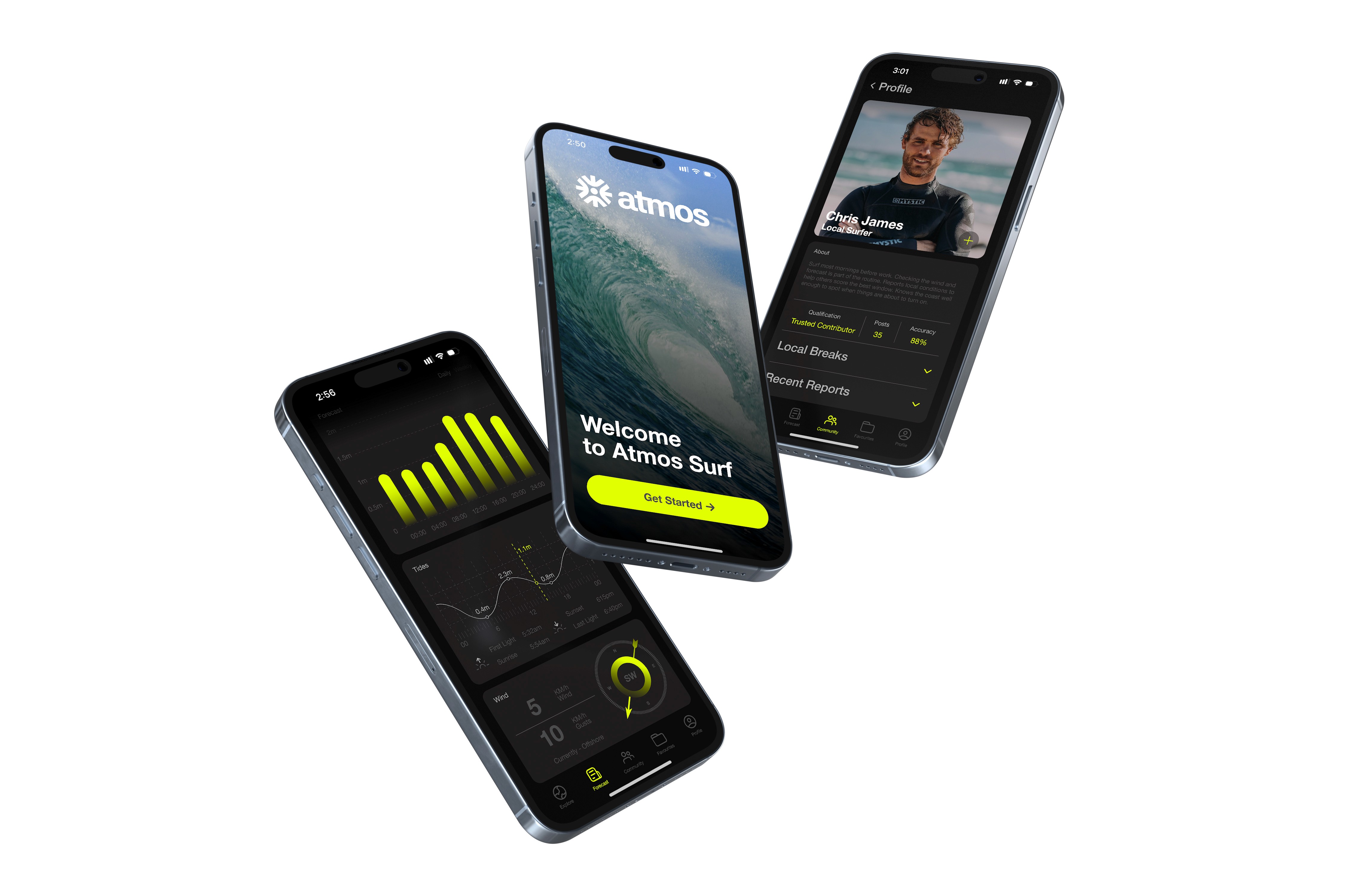
Atmos reads two things at once, the surf and the sky. We built the identity around that, a dark, high contrast field with acid green. Every decision, from the wordmark to the app interface, comes back to the same brief. Legible, fast, felt instantly.
Atmos reads two things at once, the surf and the sky. We built the identity around that, a dark, high contrast field with acid green. Every decision, from the wordmark to the app interface, comes back to the same brief. Legible, fast, felt instantly.
DESIGN SYSTEM
DESIGN SYSTEM
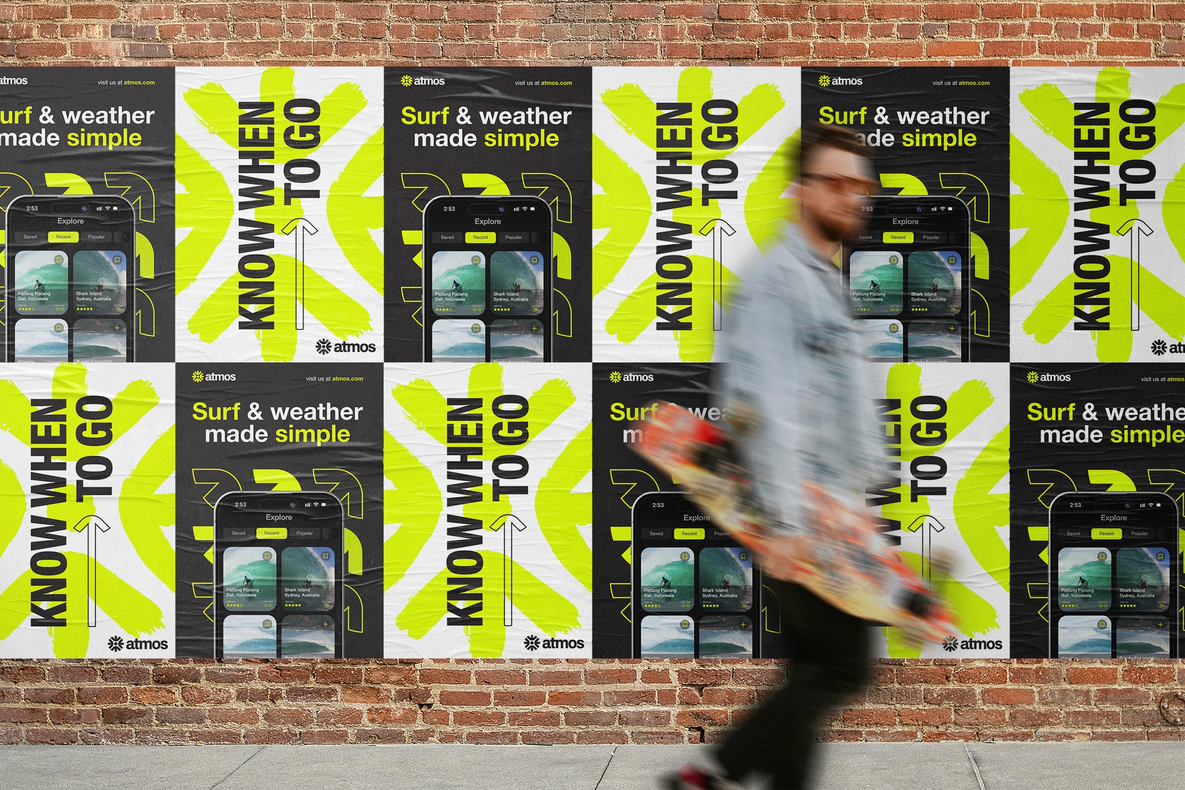
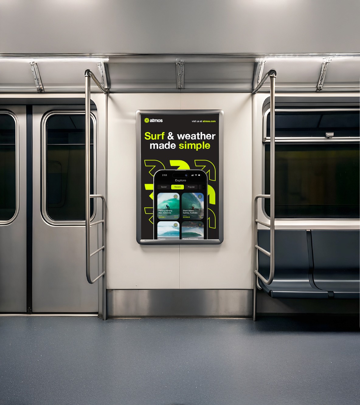
The system is built on directional language. Arrows pulled from swell charts and wind maps became the brand's core motif, recurring across the app UI, outdoor advertising and merch as a visual shorthand for movement. A tight palette of charcoal, white and acid green keeps every touchpoint instantly readable and recognisable whether it's a phone screen or a billboard at street scale.
The system is built on directional language. Arrows pulled from swell charts and wind maps became the brand's core motif, recurring across the app UI, outdoor advertising and merch as a visual shorthand for movement. A tight palette of charcoal, white and acid green keeps every touchpoint instantly readable and recognisable whether it's a phone screen or a billboard at street scale.

Built for people chasING conditions.
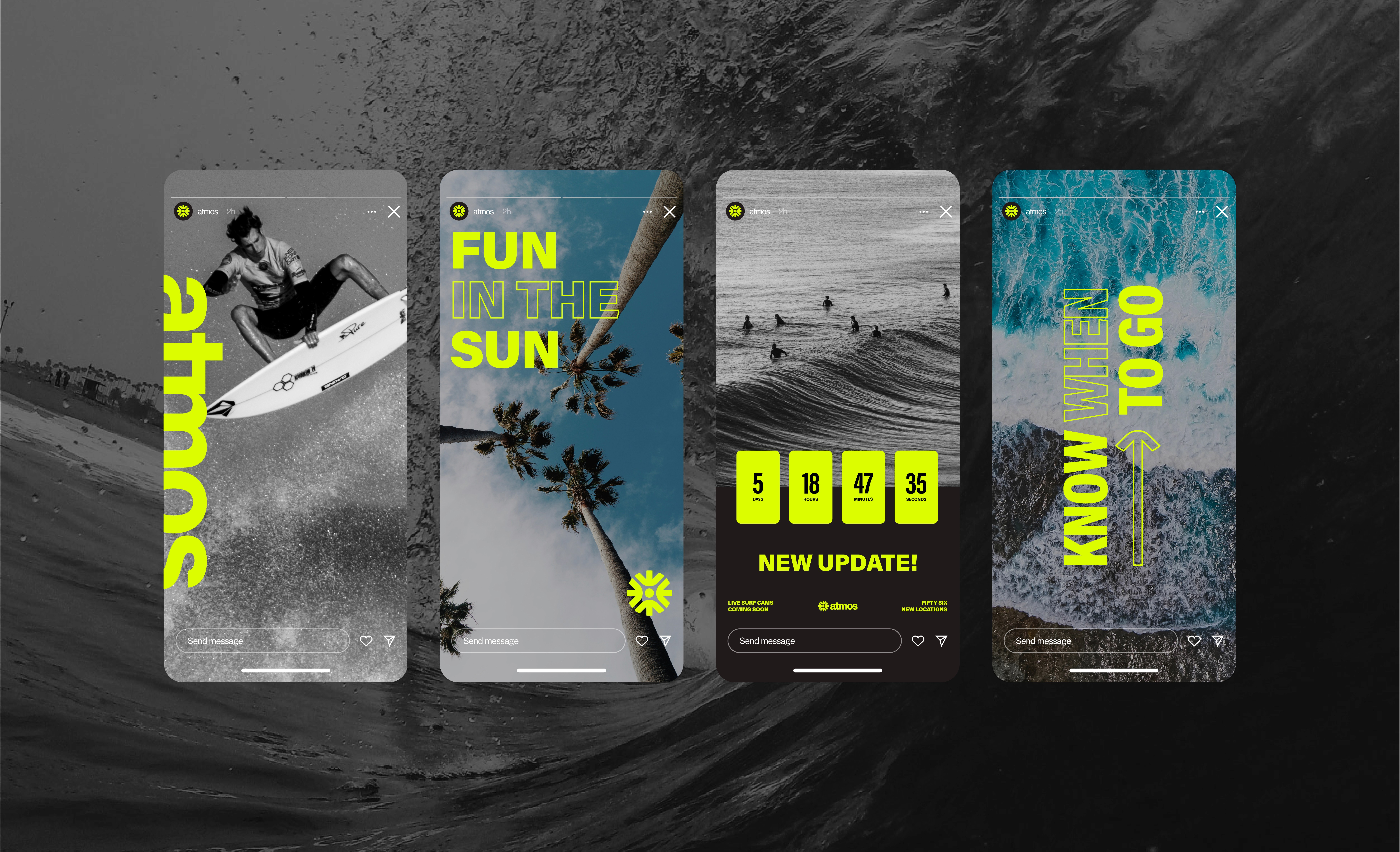
Atmos couldn't just live on a screen. We extended the identity beyond the app into outdoor advertising, apparel and product photography so the brand has a physical presence in the world, not just an interface. The same arrow system and colour logic carry through every format, giving Atmos a consistency that reads instantly, wherever it shows up.

Built for people chasING conditions.
Atmos couldn't just live on a screen. We extended the identity beyond the app into outdoor advertising, apparel and product photography so the brand has a physical presence in the world, not just an interface. The same arrow system and colour logic carry through every format, giving Atmos a consistency that reads instantly, wherever it shows up.